OPTIMIZING THE HOME PAGE
Goal:
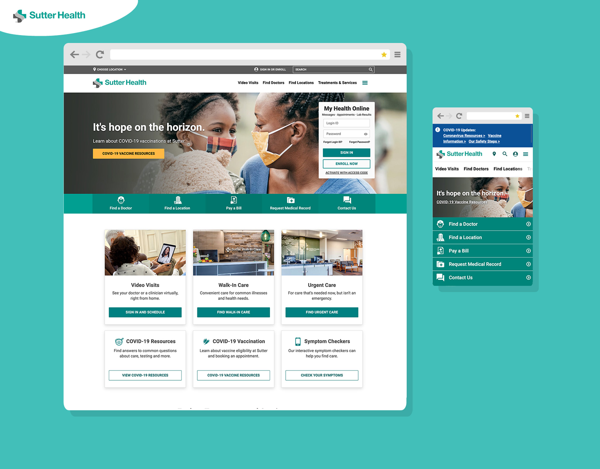
Surface 4-6 most-used actionable items on Sutter's home page.
Overview:
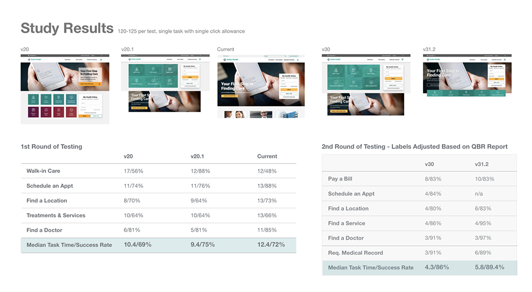
Created multiple iterations and evaluated against each other via click test to gather data around Time on Task and Success Rate.
Outcome:
Reduced Time on Task from 12.4 seconds to 5.8 seconds.
Improved Success Rate from 72% to 89%
IMPROVE EXPERIENCE OF INTAKE FORM FOR APPOINTMENTS
Goal:
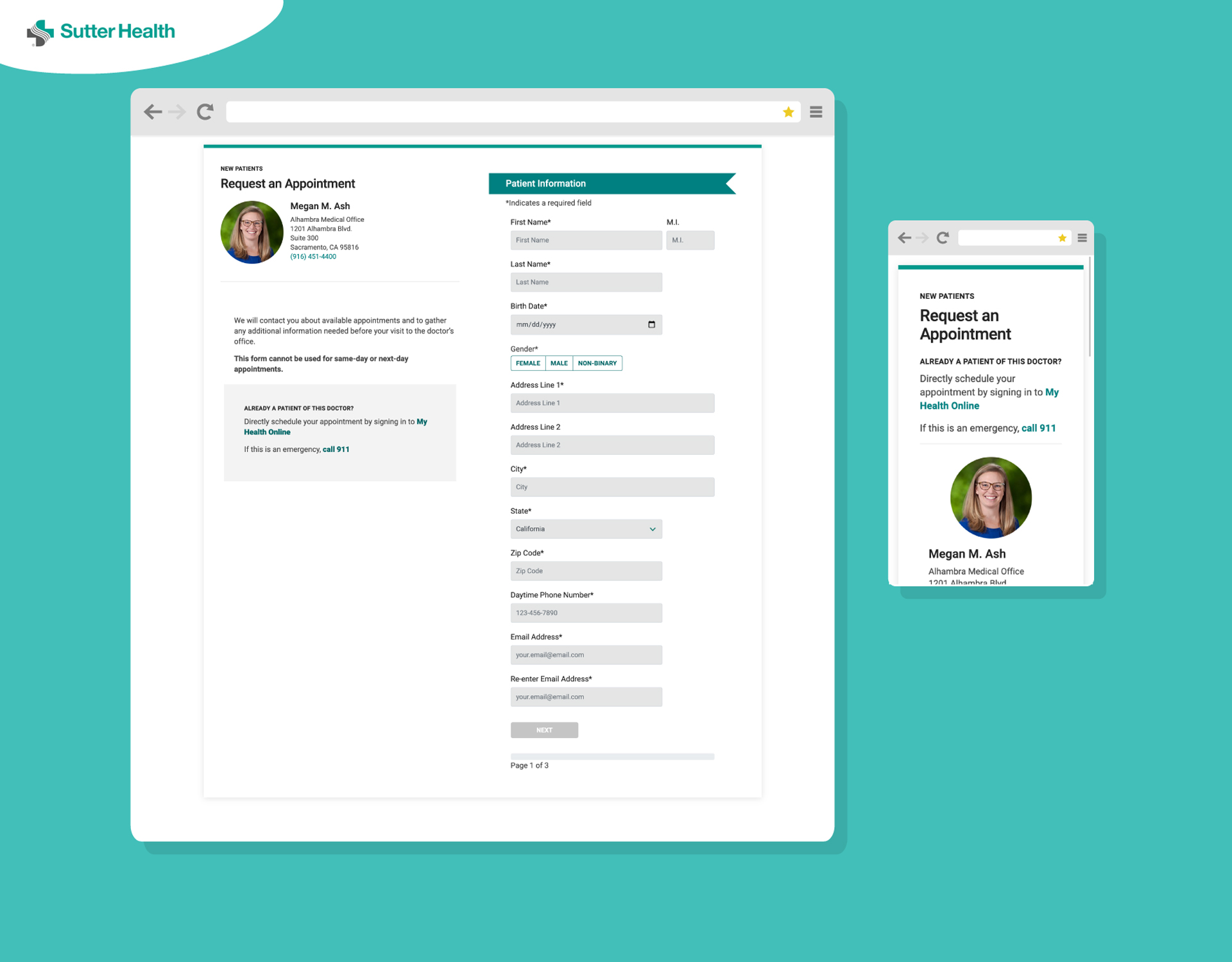
Re-design the existing, non-responsive, single-page intake form for new patient appointments.
Overview:
I designed a multi-step form to reduce the perceived length of the form and incorporated a progress bar to give users an immediate sense of how long it will take to fill out the form.
Outcome:
Created a user-friendly and mobile-responsive form for one of Sutter's main acquisition channels.
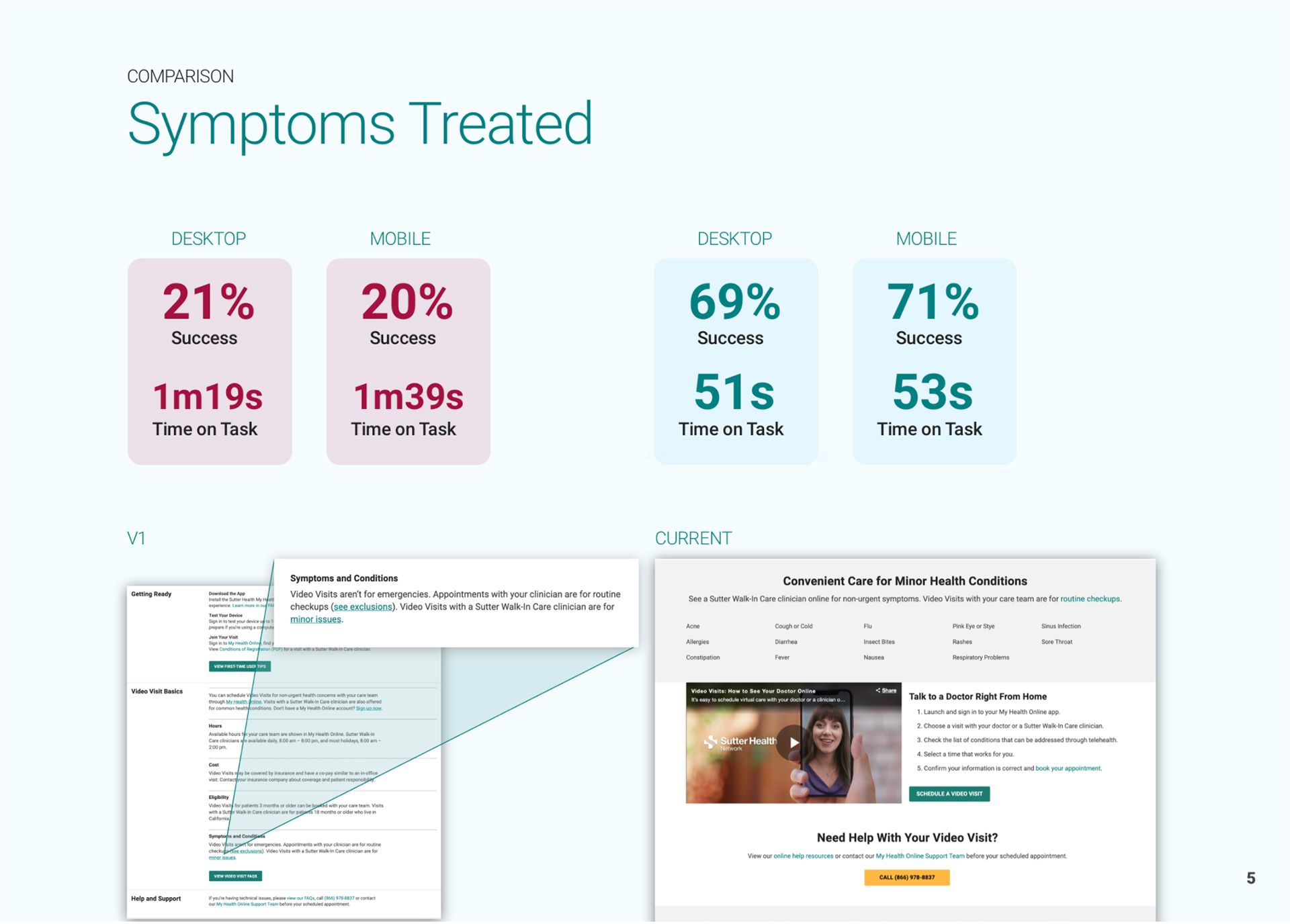
RE-THINKING THE VIDEO VISITS LANDING PAGE
Goal:
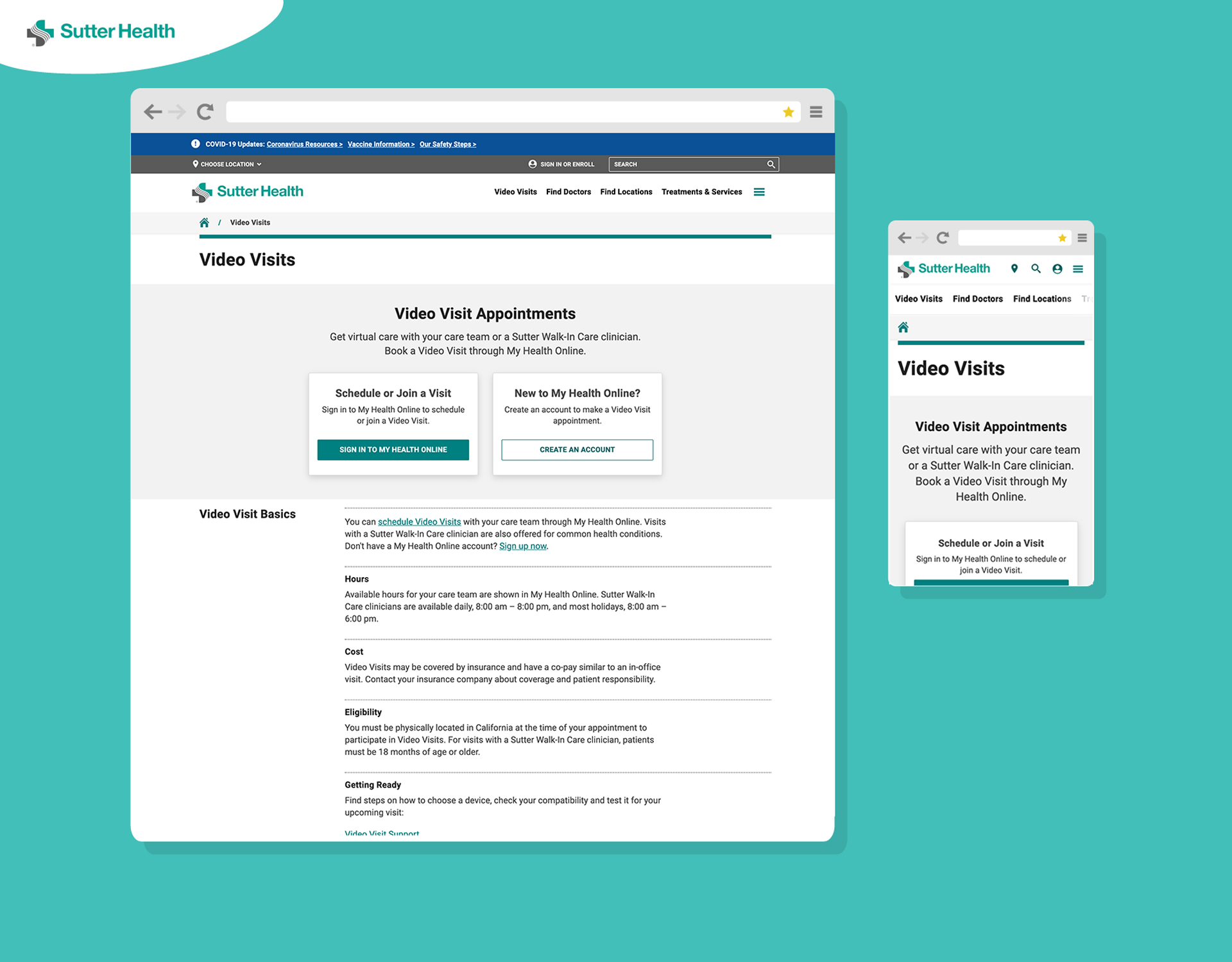
Improve UX on Video Visits Page
Overview:
In the beginning of the pandemic, Sutter saw a rise from 50 video visits/month to thousands. Through surveys, clicks test and task-based tests, I gathered data to find pain points and gain knowledge.
Outcome:
Reduced friction, refined pathways for existing and new patients and surfaced the most desired information.